Chapter 9: Charts
Learning Objectives
- Insert a Clustered Column Chart.
- Rename a chart title.
- Add horizontal and primary axis titles.
- Add data labels.
A chart is a visual representation of numerical data to reveal trends, or patterns so that users can make informed decisions. Excel provides many chart types you can easily use in your workbook.
Let’s create a clustered column chart, considered the most popular chart in Excel. You need data before you make a chart.
The Figure below shows the student attendance for five students. You will create a clustered column chart showing the student attendance with the student names and the number of days attended.
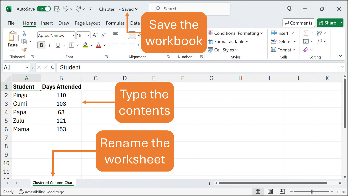
Type the contents in their respective cells. Use the default font and font size. You may format the contents or adjust any column width if necessary. You can rename the worksheet as shown in the Figure.
You can save the workbook with any file name you prefer, or just save it as Chapter9.xlsx for this Chapter.
There are two steps to insert a chart, select the contents and insert the chart. Refer the Figure below to select the contents.
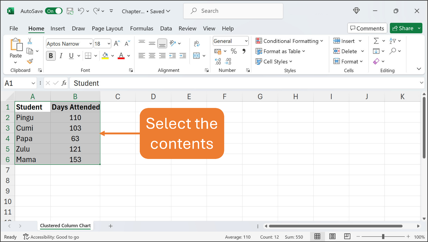
To select the contents from cell A1 until cell B6, click and hold the mouse button on cell A1 and drag your mouse until cell B6. The affected cells should be selected or highlighted as shown in the above Figure.
While the contents are being selected, click the Insert tab, then the Recommended Charts button. When you click the Recommended Charts button, the Insert Chart dialog box should appear. Refer to the following Figure.
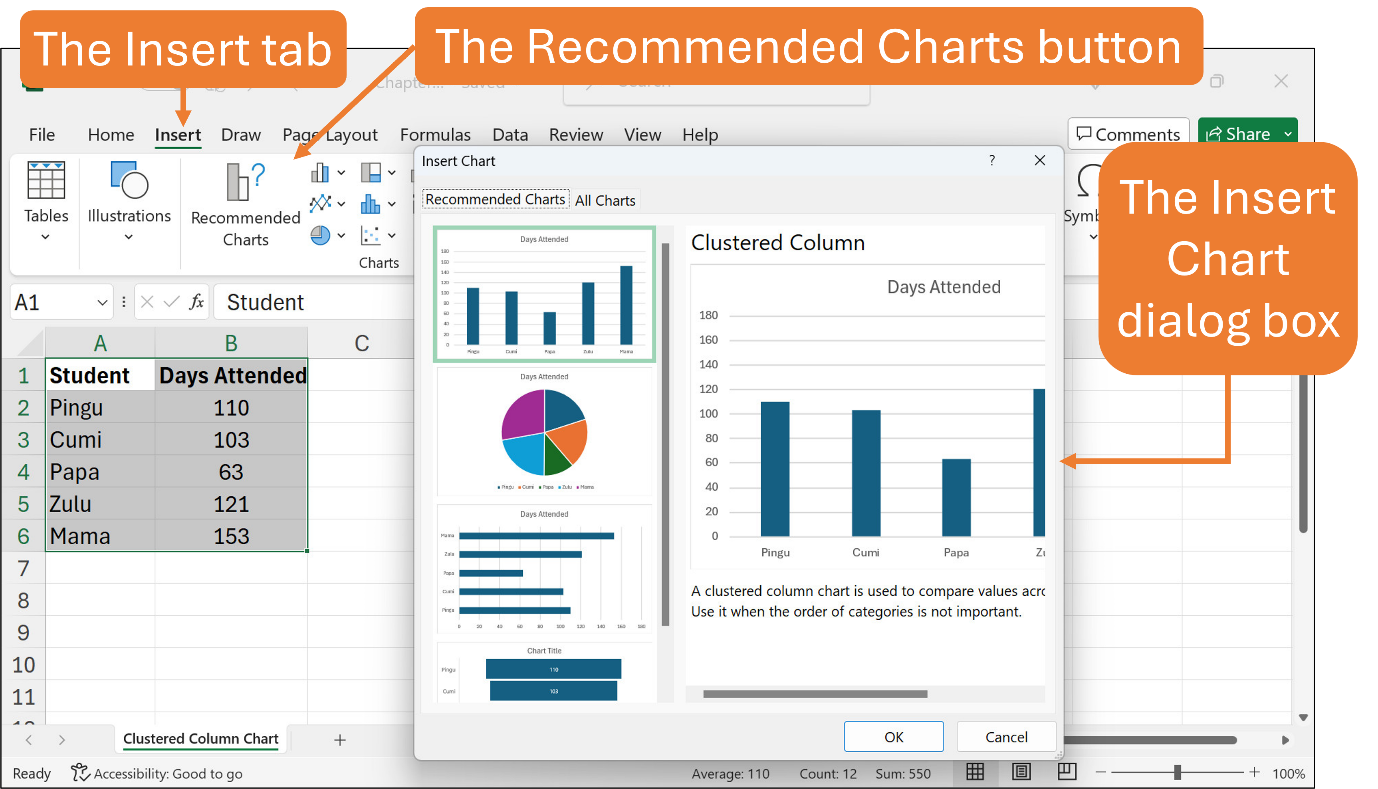
The Insert Chart dialog box gives you access to create any chart that is compatible with your contents or data, together with the preview of the chart. In this example, you are going to insert a clustered column chart, which is the first chart in the dialog box. You can ignore the other chart types for now.
Just make sure the clustered column chart is selected and then click the OK button at the bottom of the dialog box. The chart should be instantly inserted into the worksheet.
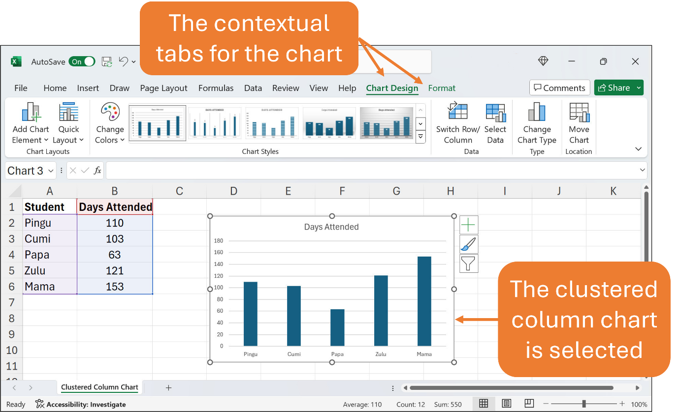
When the chart is inserted into the worksheet, you will see two contextual tabs appear, so-called the Chart Design and Format tabs. These tabs contain more buttons and options within for configuring the chart such as adding the chart title, the horizontal and vertical axes, and the data labels.
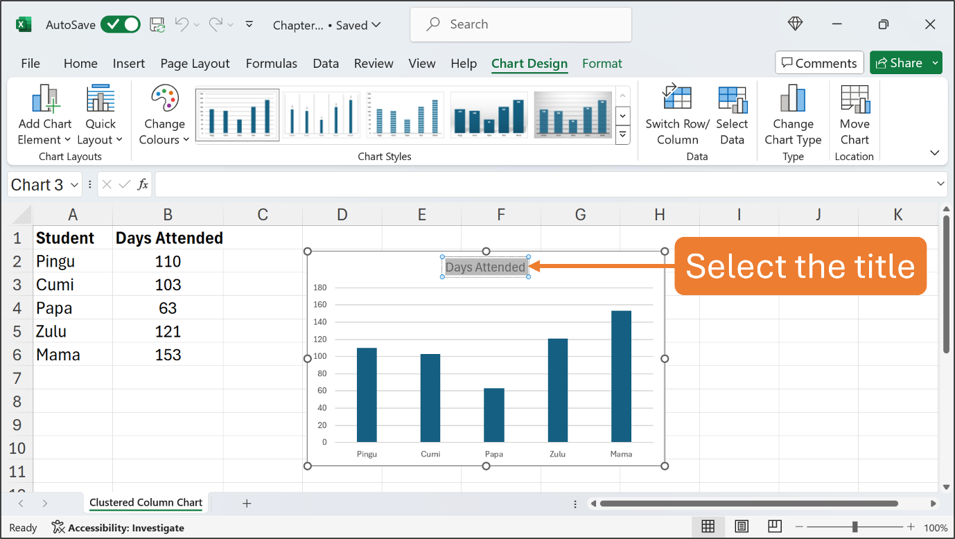
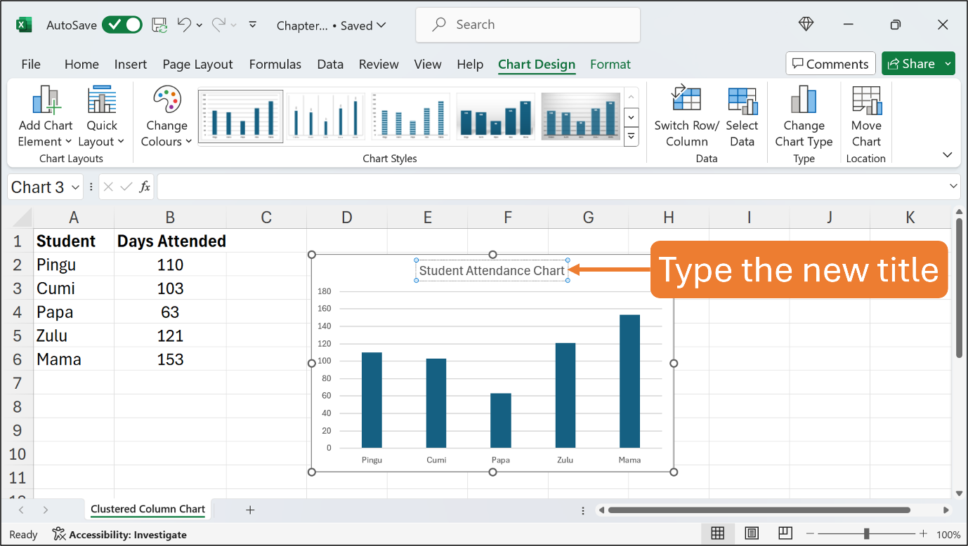
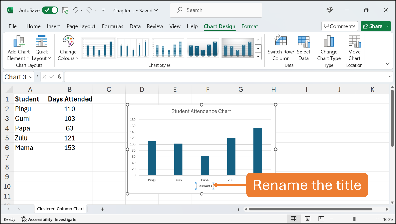
To change the chart title, simply click the title, select the text, and type Student Attendance Chart. Follow the Figures below.
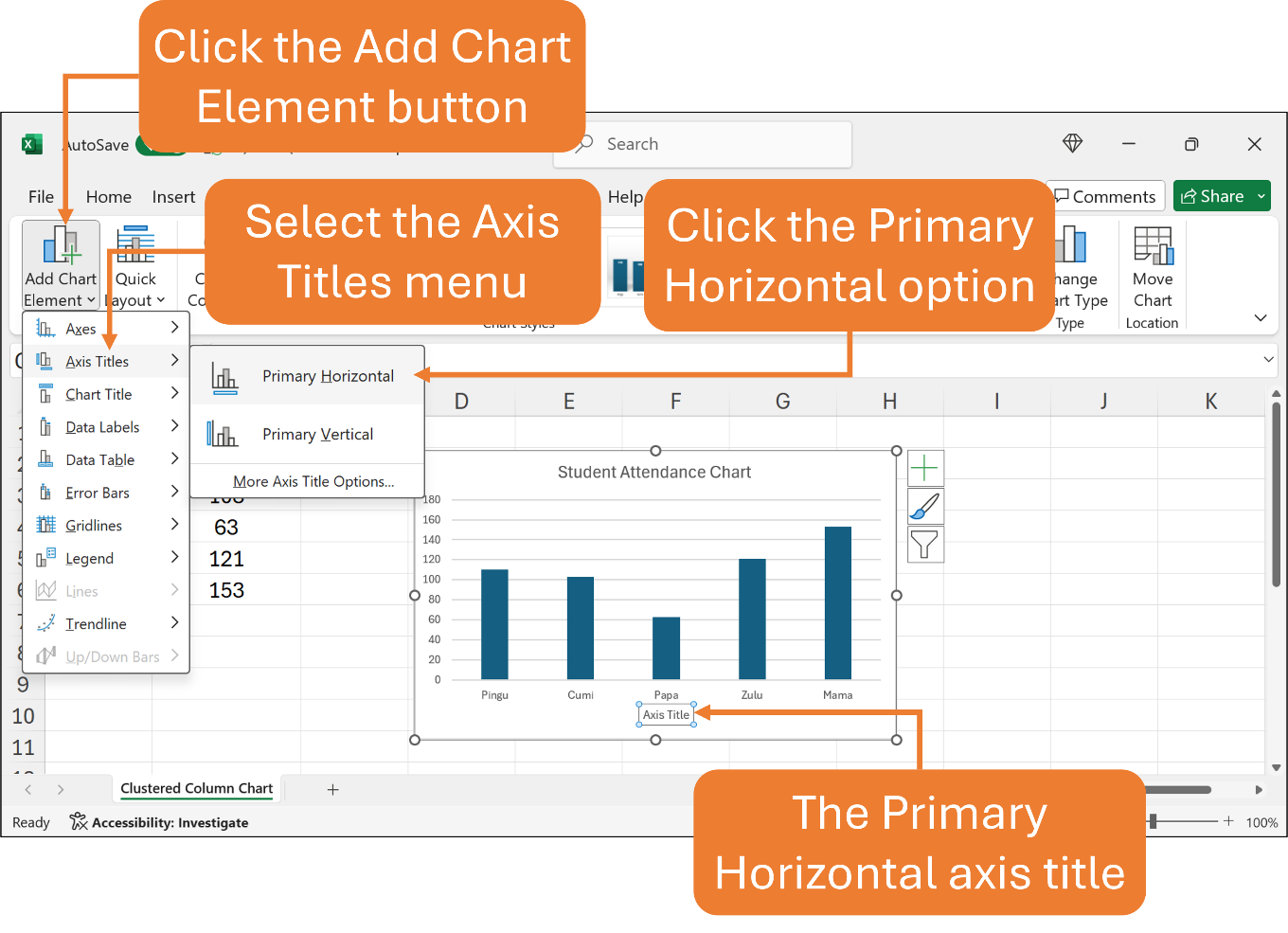
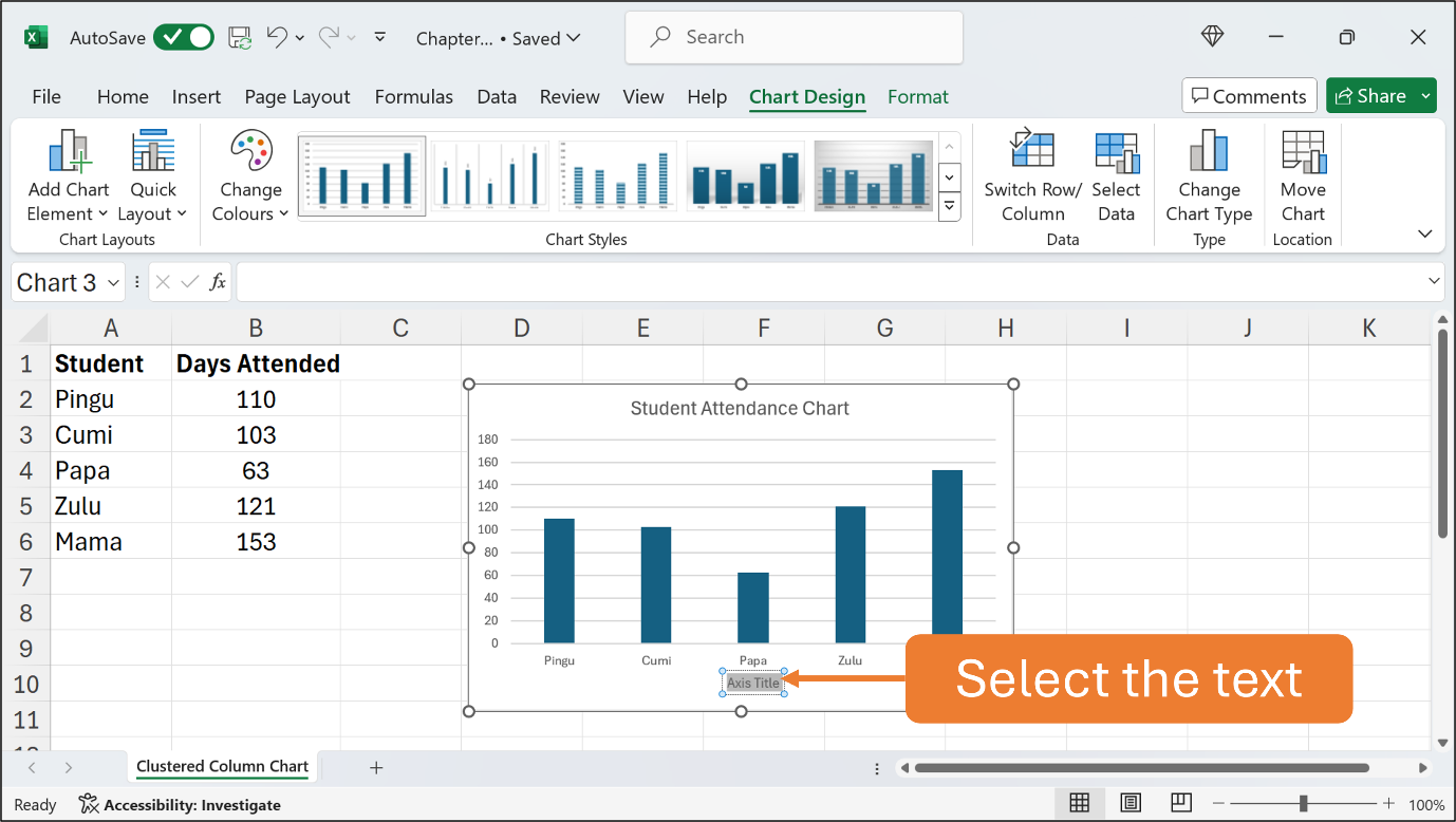
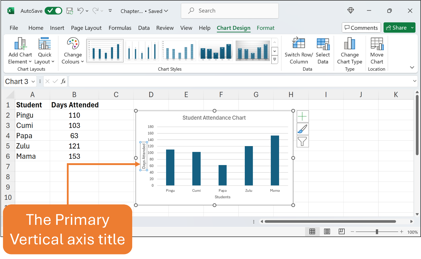
Next, let’s add the axis titles, called the primary horizontal and primary vertical axis. Make sure the chart is selected so that the Chart Design tab appears. Click the Chart Design tab to open its ribbon. Click the Add Chart Element button and you should get the list of menus. Choose the Axis Titles menu and click the Primary Horizontal option. Straight away you can see Excel inserts the title for the vertical axis. Now you can select the text in the Primary Horizontal axis title textbox and rename it to Students. Follow the Figures below.
You can proceed to insert and rename the Primary Vertical axis title. Use the same steps as above but this time, you select the Primary Vertical option from the menu. Rename the axis title for this to Days Attended. See the Figure below.
At this stage, you are supposed to have a new chart title as well as the primary horizontal and vertical axis titles.
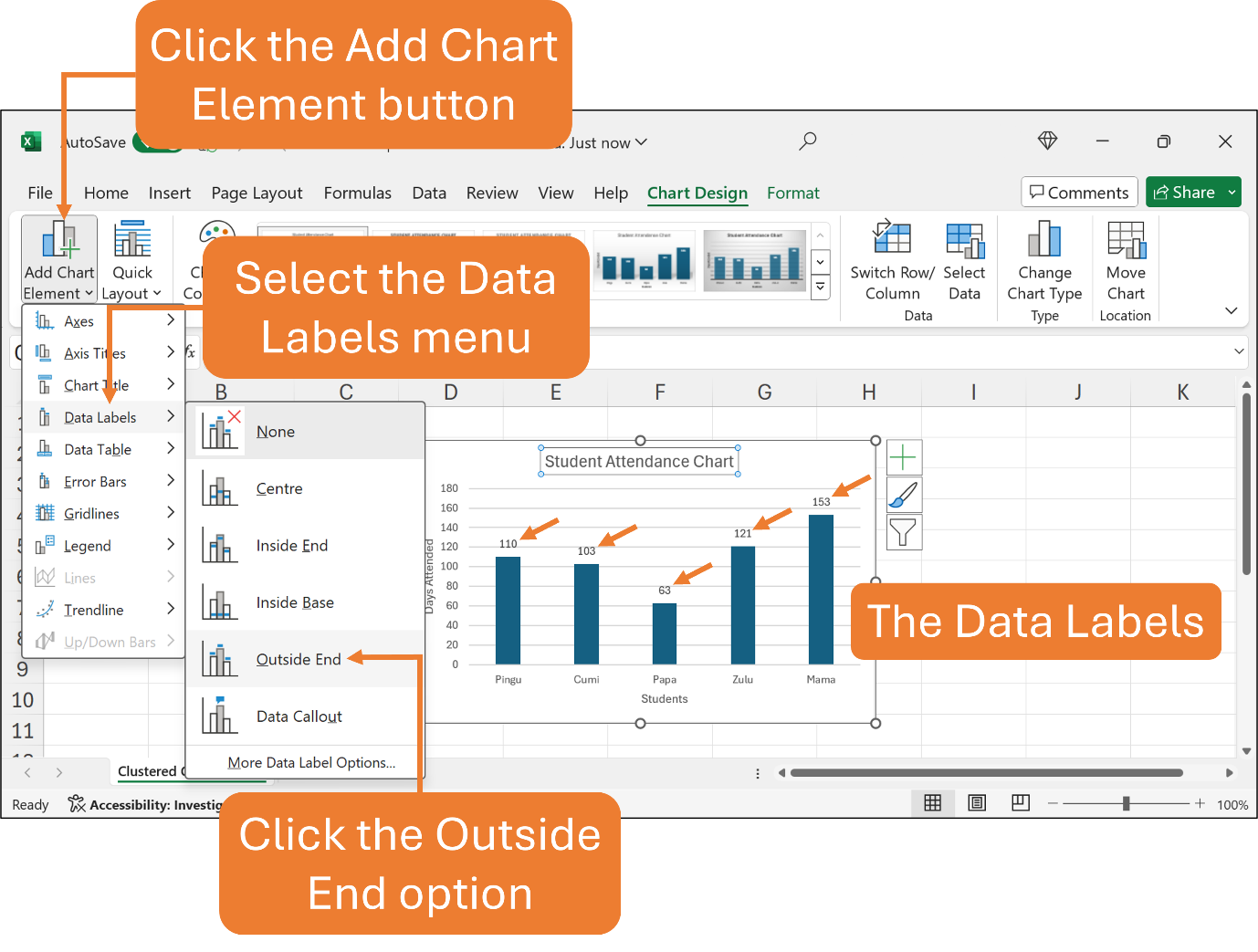
In addition, data labels are descriptive labels that show the exact value of the data points on the value axis. To insert data labels into the current chart, select the chart then click the Chart Design tab. Click the Add Chart Element button and from the menu list, select the Data Labels menu. You will get several data label options such as Centre, Inside End, and Outside End. For this chart, choose Outside End. Refer to the Figure below.
There are other charts that are also useful depending on the kind of data that you want to represent such as a stacked column chart, a pie chart, and a line chart. You can follow the same steps above to create basic charts.
That’s all for this Chapter.
You’re awesome!
A chart allows you to illustrate your workbook data graphically, so it is easy to visualize comparisons and trends.
